
Int'l Dyslexia Association
Building a Better Brand Experience for a Vital Nonprofit

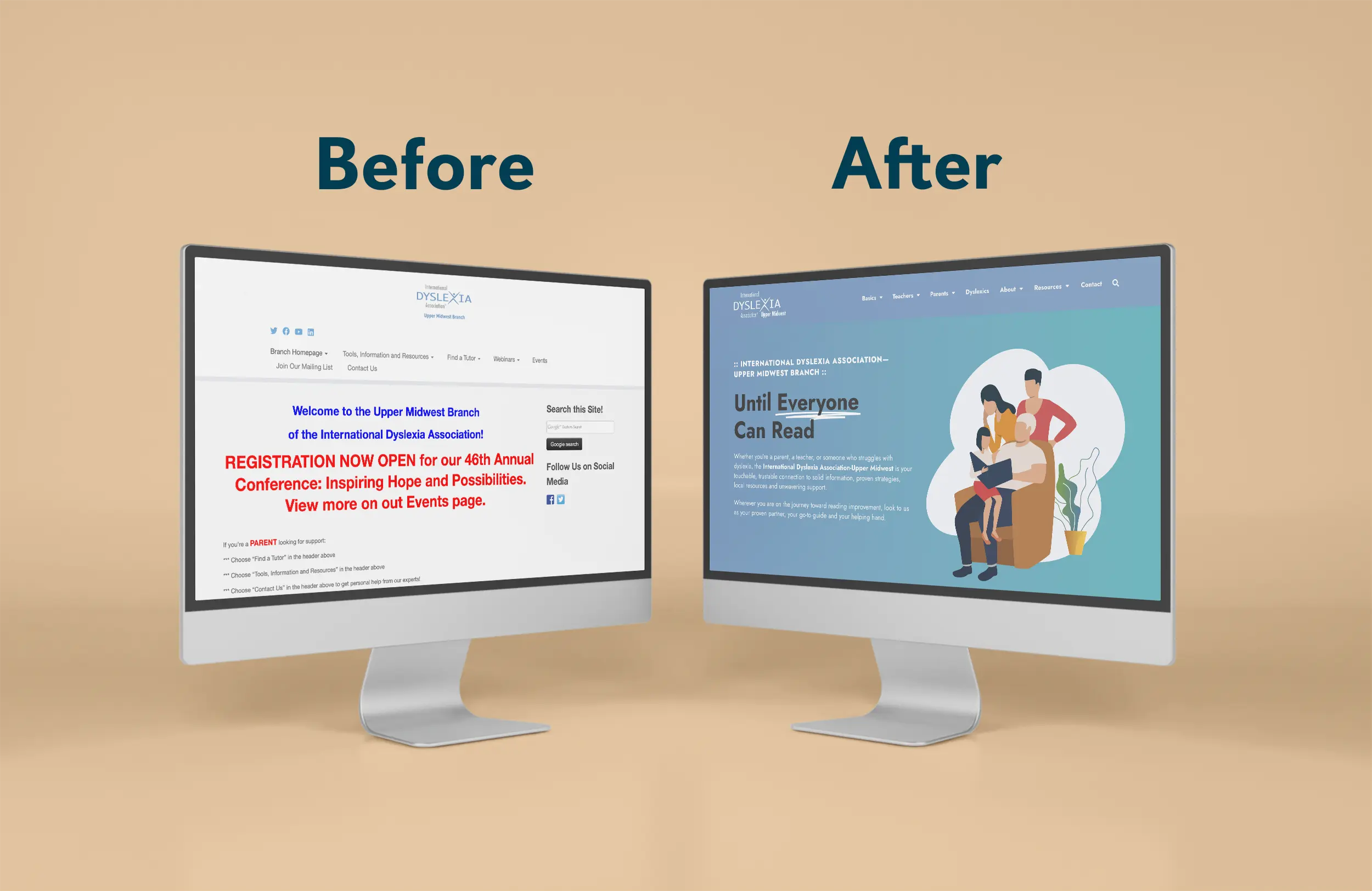
the SITUATION
The IDA-Midwest Branch’s website suffered from confusing navigation, lack of responsiveness, bland content, and a stripped down design—not the best experience from an organization dedicated to those with reading challenges. They needed a complete re-imagining of their web presence that would help teachers, families and people with Dyslexia easily find the information they need, feel hopeful about treatment and reach out for support–all while experiencing a warm and inviting experience.
the solution
They needed to retain their logo which was tied to their national organization, so I chose a flexible color palette and brand font that reflected the warm, friendly, and optimistic nature of their work. A featured element of their new design language was the use of illustrations to further communicated a softer, friendlier look and feel compared to stock photos.I developed a new platform of emotionally-engaging brand messaging to underscore the empathy and support they offer their audience and wove that into the robust informative content they provide. Clear navigation, prominent calls-to-action, a responsive layout, and flowing design exponentially improved the user experience and continues to delight their visitors.

testimonial
I highly recommend him for your
next project!
Working with Adam on updating the branding and website for the International Dyslexia Association-Upper Midwest was seamless. His guidance on messaging, creative eye in design, and attention to detail in development was second to none. Adam is a down-to-earth, relatable professional who provided a superior experience and end product. I highly recommend him for your next project!
Kari BucholzBoard Member, IDA-Midwest Branch