Sparrow
Helping a Luxury Vacation Rental Brand Take Flight
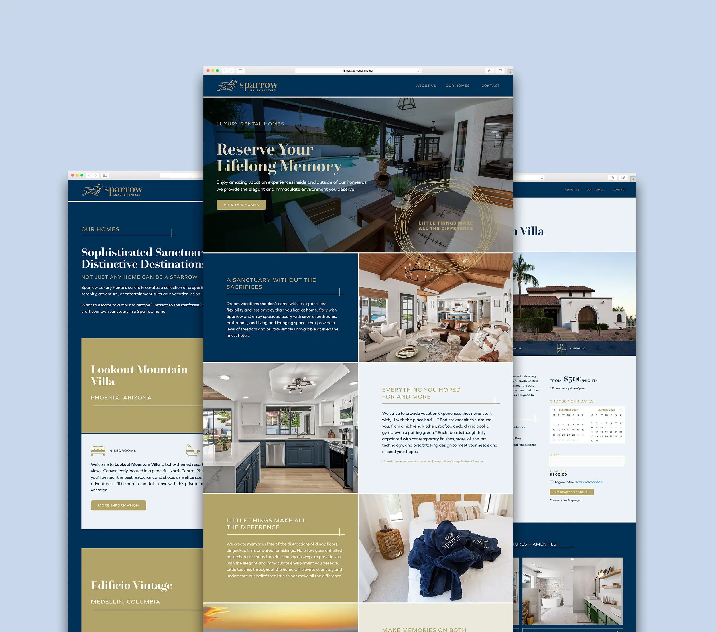
In a saturated rental home market, visitors expect a high level of care and style, particularly in the luxury segment. The founders of this new company carefully curate the homes they purchase and renovate. They provide a truly elegant experience, so they needed to establish a brand that helped them more effectively attract luxury renters and enhance the in-home experience.
the solution
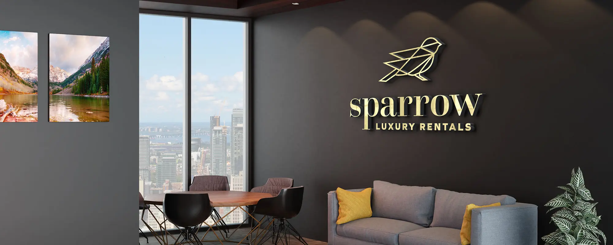
One of the strongest points of value for the company is their obsessive commitment to providing a spotless, updated home with various smaller touches of elegance and care throughout. While many homes in this price range are nicely appointed, it’s—as their new tagline says— the “little things that make all the difference.” This double entendre reflects the care and attention shown within the homes, as well as connecting to the name and logo we developed to represent it—Sparrow.
The color palette is highlighted by a luxurious brushed gold and a regal blue, and the typefaces were carefully curated to draw in clients that appreciate an upscale sense of style. Every brand material is of the highest quality and craftsmanship, including coasters and business cards with letterpress printing and gold foil stamping. The use of a nest graphic reinforces the sense of comfort and home they create for visitors.
deliverables
Logo Concept