
The Collection Dept.
Complete Brand Development for a Local Accounts Receivable Collections Startup
After decades of lending their respective talents to other firms who follow traditional models of accounts receivable collections, the founders of The Collection Dept. struck out on their own to offer an uncommonly flexible and client-centric approach. As a new business, they needed a brand that was strategically sound, visually engaging, and authentically expressed.
the solution
I began by thoroughly exploring the competitive landscape and developing a brand strategy that would effectively separate them from competitors out of the gate. I identified strong points of differentiation among their competitors—flexible contracts, cost-effective flat rate fees, and their unique “train & transition” model. A new platform of brand messaging would help them articulate that unique value via the website, proposals and in-person communications.
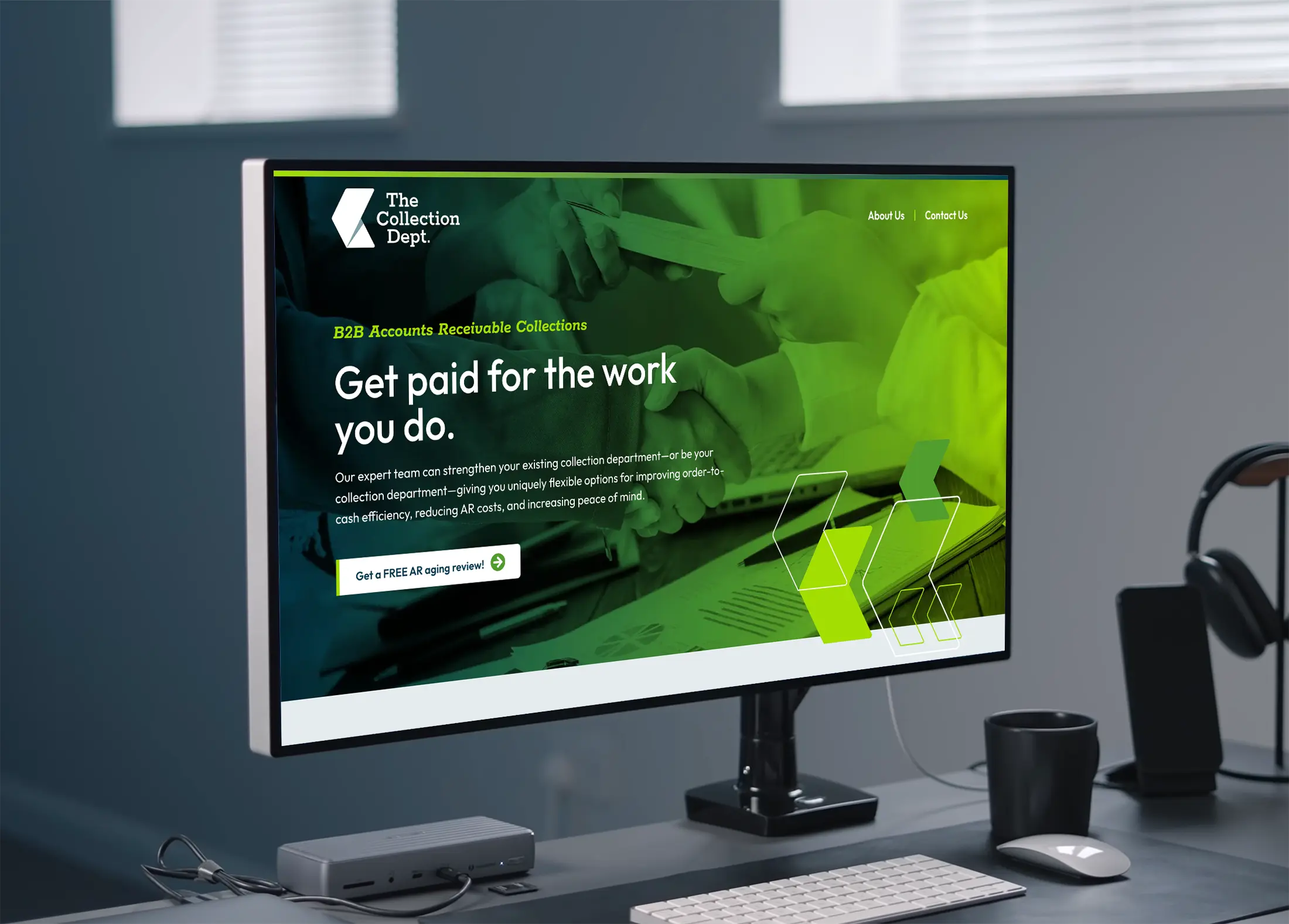
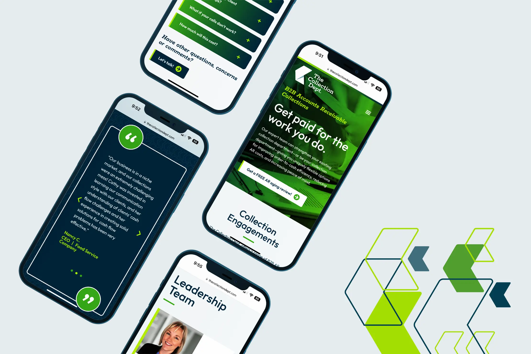
Their new name—The Collection Dept.— wraps a persona around the brand and positions them as a go-to member of their clients team. A clean and modern logo brings to life the concept of “moving cash flow in the right direction,” and a system of vibrant colors, type, and design elements perfectly reflect the energy, approachability and professionalism of the experience they give clients.
Being a new business, they wanted to establish a web presence as soon as possible, while building the site for easy expansion and evolution as their business grows. For the launch, I built a solid framework of core pages to introduce prospects to the company and its unique value, and then created a series of expandable templates on the back-end for easier creation of new pages, blog posts and deeper content. With strategy, messaging, identity and a website in-hand, they were ready to engage and delight their ideal clients.
deliverables
Content Development
Logo Concept
testimonial
Shout out to Adam Davies and Davies Branding + Design for the professional guidance and beautiful result on our brand messaging, logo and website. I appreciate that he has a great process and the results are always spot on. This is the third time I’ve worked with Adam on a branding and website project in the last 10 years. He is a pro!